Recent Project Cultivating Identity.
Building the BAFARM Brand from the Ground Up.
Overview
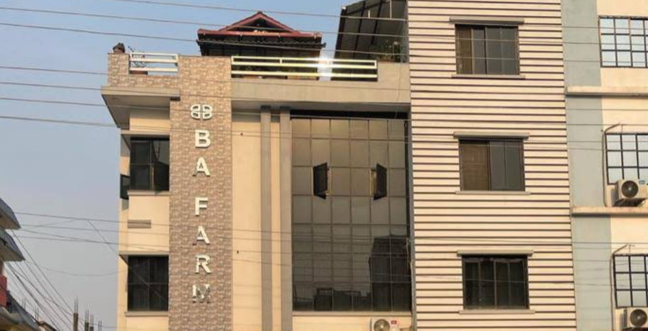
In a region where the strategic power of branding often lies dormant, Buddhanagar Agriculture Farm (BA Farm) emerged with a powerful mission: to revolutionize the local agricultural landscape by directly connecting farmers to the market and ensuring fair compensation for their hard work. Recognizing that a compelling visual identity was paramount to conveying this impactful purpose and establishing crucial trust, they sought a design partner to build their brand from absolute zero. This is the story of how a carefully crafted symbol, born from a singular vision, laid the foundation for a brand with the potential to cultivate significant impact within its community.
Challenge & Context
Buddhanagar Agriculture Farm was a nascent entity venturing into a traditional and often fragmented market. Faced with a completely blank canvas, their core challenges were significant:
- Establishing immediate trust and credibility within the local farming community, who might be wary of new initiatives.
- Clearly and concisely communicating their unique value proposition of fair trade, direct connection, and amplified farmer voices.
- Creating a memorable and easily recognizable brand that would differentiate them from established middlemen.
- Building a robust foundation for future growth, farmer engagement (aiming for a potential 20% increase in direct partnerships within the first year), and broader market recognition.
My Solution
My approach to this project went beyond mere aesthetics. Faced with the challenge of building a brand where none existed before, my focus was on understanding the core values and the intended community impact of Buddhanagar Agriculture Farm. I didn't just design a logo; I crafted a visual language intended to resonate deeply with their target audience and communicate their mission with clarity and cultural sensitivity:
Design Process
Initial Draft & Feedback
I created the first logo draft based on the lighting designer’s feedback, which did not feature any infinity element. After reviewing the submission, the CEO’s feedback prompted a critical pivot—he insisted on incorporating the infinity symbol.
Revisiting the Concept:
Embracing this new direction, I revisited my sketches and research. I explored various ways to integrate the infinity sign without falling into clichés while respecting the brand’s identity. I challenged myself to integrate the element subtly and abstractly.
Final Refinement:
Over the course of two days, I refined the design to incorporate my creative reinterpretation of infinity. The custom typography, especially the unique treatment of the “x,” and the carefully selected color palette came together as a cohesive, modern logo. I then prepared a presentation with realistic mockups to illustrate how the logo would work across various mediums.
Final Outcome
A Unique Visual Identity:
An abstract, reinterpreted infinity symbol that avoids cliché while reinforcing the brand’s name and values.
Customized Typography:
A modern, sans-serif treatment with a unique twist on the “x” in “Luminex” that signals progression and forward-thinking.
A Trustworthy Color Palette:
A blend of futuristic cyan-blue and dark gray, conveying both innovation and reliability.
Reflection & Takeaways
Clear Communication is Critical:
The project underscored the importance of refining ideas through open dialogue. Even when initial expectations differ, clarity leads to better designs.
Creativity Over Cliché:
Incorporating the infinity symbol necessitated a creative solution—one that honors the brand’s name without falling into overused imagery.
A Logo is a Long-Term Asset:
This experience reinforced my belief that quality design is a strategic, long-term investment. A thoughtful logo helps build consistent brand recognition over time.
Get in Touch with me.
If you believe in the power of strategic storytelling through design and would like to create a brand identity that stands out, let’s connect. Together, we can translate your vision into a timeless visual mark.
- mr.theneuch@gmail.com
